I-Tracker Student Detail Page
I-Tracker is an application for educators who need a quick but detailed view of a student’s school life. The biggest selling point of I-Tracker is its ability to create and track interventions for students.
The challenge was to find out how the product could better serve our users, bring the look and feel up to modern UX/UI standards, and increase the value of the application by incorporating more than the current English and Math Data.
My role
Sole UX/UI Designer on the project in charge of the full design process.
The team
Myself, a project manager, three developers, and the director of the company.
Tools
Surveys, interviews, focus groups, Adobe XD, Illustrator, and Balsamiq.
Competitor research
Key Finding #1:
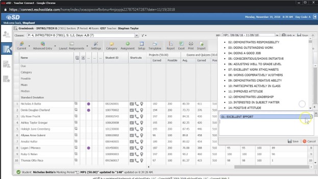
There were applications already pulling data from the state of Delaware for other purposes. These applications included snapshots of student data that were great indicators of how the student was performing overall academically.
Takeaway: I could see the opportunity to provide a more detailed image of a student by showing their progress. I also believe we could offer a wider view of students that passed academics i.e. behavior, attendance, etc.
Key Finding #2:
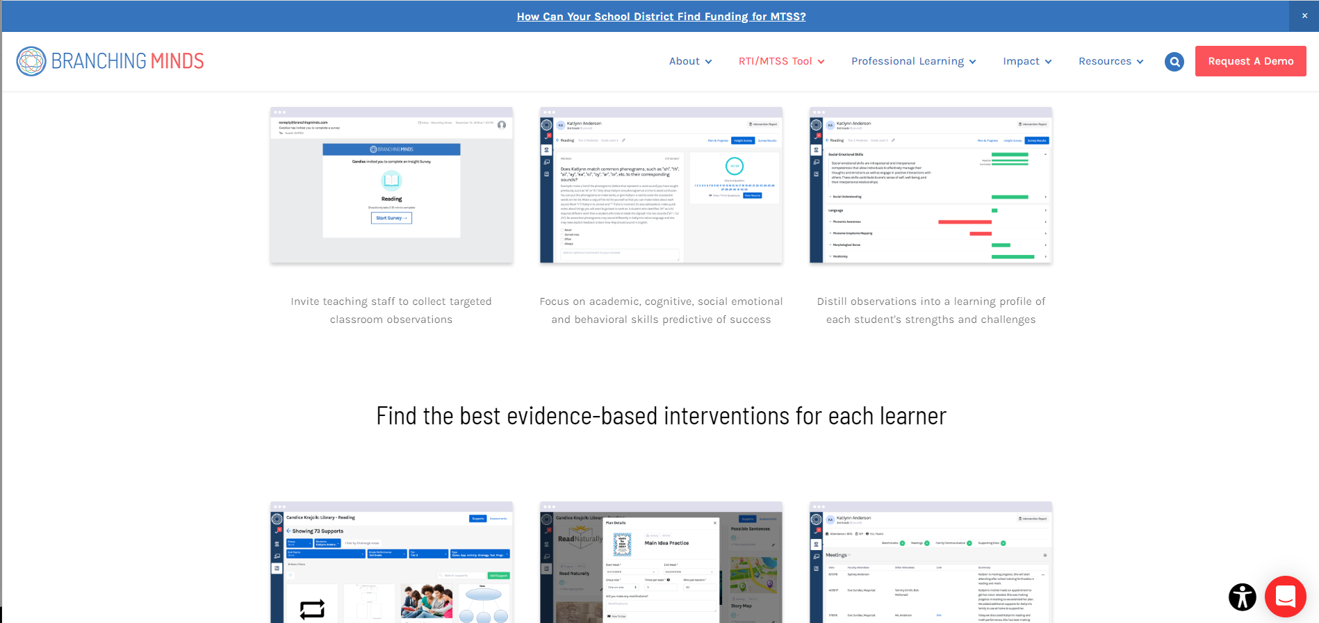
There are bigger companies that specifically deal with student interventions, but they put much of the work on the users (especially when it comes to data entry). Most of these sites tracked where a student currently was in intervention and not the journey they have been on.
Takeaway: I had the advantage of having all of the student's data in the system, and could save our users valuable time. To compete with these companies I knew I needed to incorporate better data visualization methods.
Key Finding #3:
The systems specific to a student’s intervention plan followed our process of first creating a group and then adding students to them. They had the advantage of allowing groups to remain all year, while ours were based on cycles (like marking periods).
Takeaway: There was value to seeing a student's data in a year view, but our users made decisions based on cycles most of the year. I knew it was important to find out from users which data was valuable in a year view vs being broken down by cycles.
User research
Key Finding #1:
In focus group meetings I learned our users are given roles within their schools that were specific to certain goals (making sure the student’s passed math classes, making sure the students were showing up to school, making sure a student was monitored for behavior problems, etc.).
Takeaway: I was able to put these goals into specific "views" that would help our users get to the information that matters most to them, breaking up the data this way would be new for the system.
Key Finding #2:
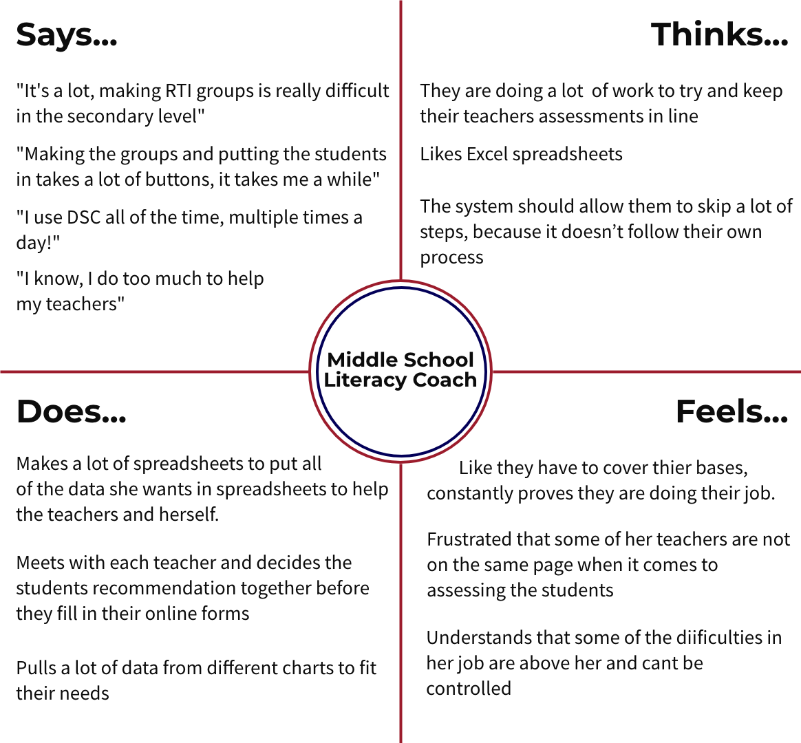
From shadowing users I was able to observe the documents they kept on their computers. I found across districts users were keeping similar files about students, especially when it came to the scores they used to evaluate a student and historical intervention data.
Takeaway: It was clear to me that I would have to incorporate a timeline of intervention history for the user to see patterns/reasons a student was in intervention.
Key Finding #3:
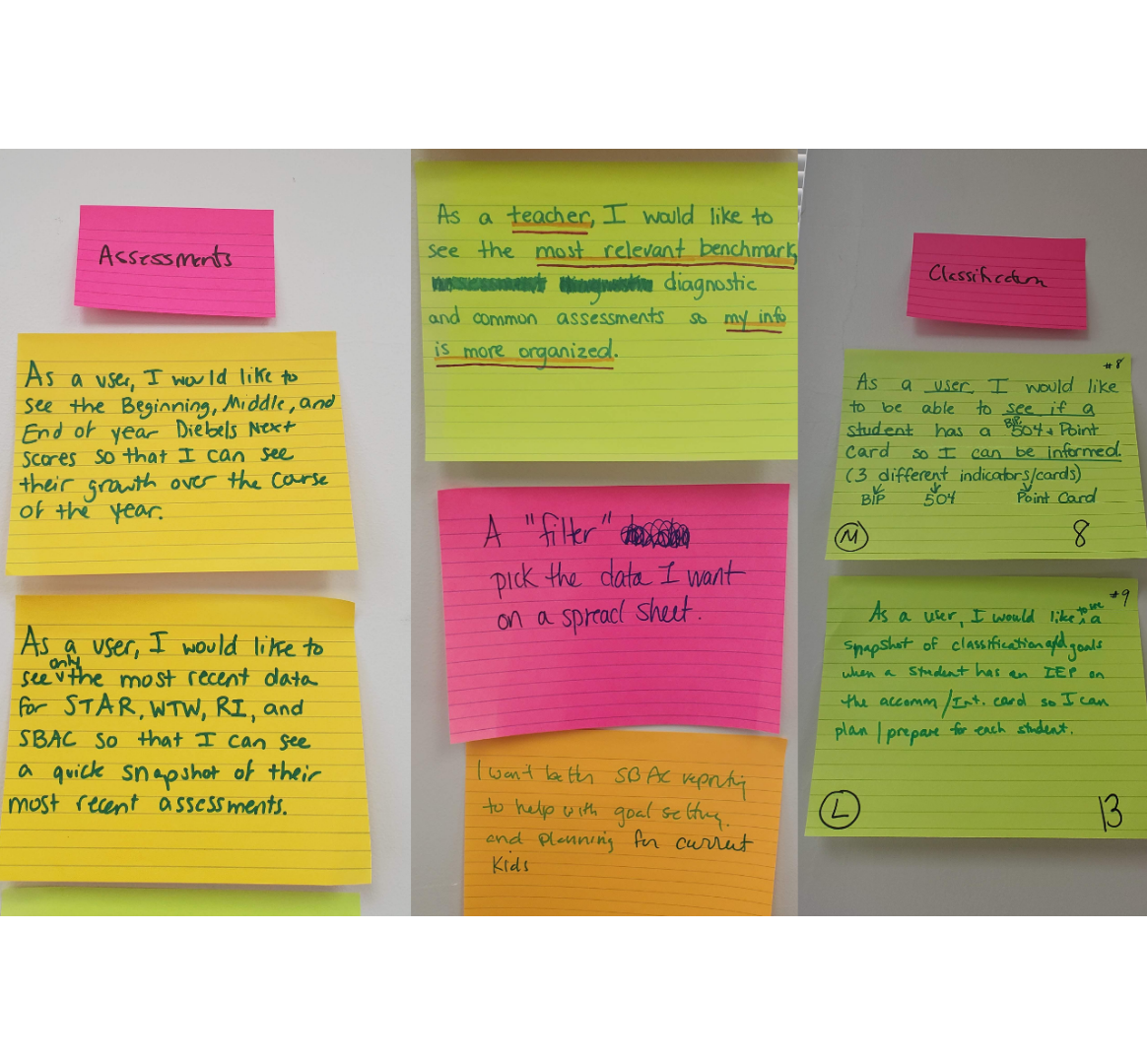
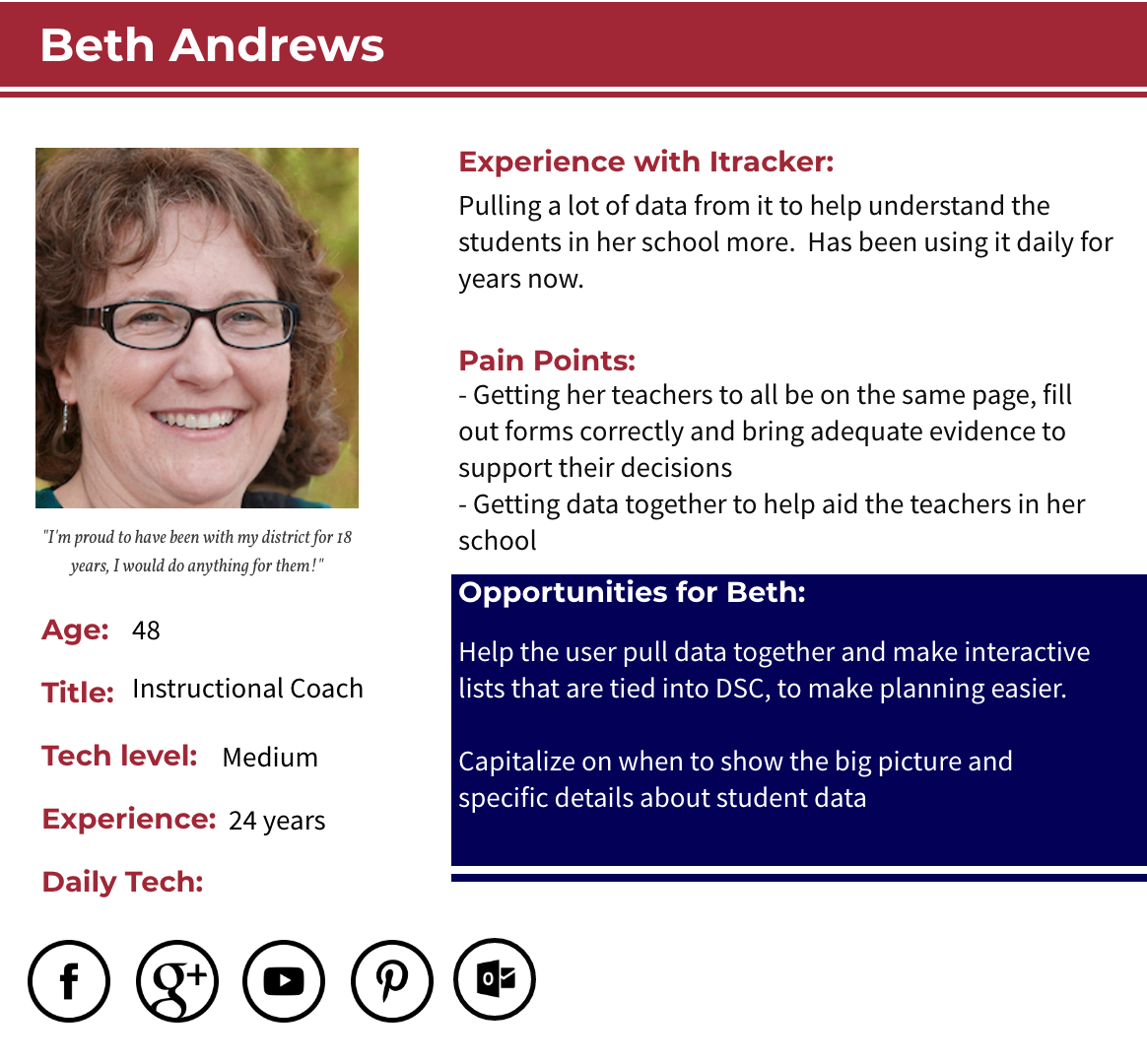
In my interviews, many users stated that our system had a strong focus on academics, but they only considered academics a small part of why a student needs intervention. They used different applications and systems, pulled the data into spreadsheets and docs, and then interpreted the data.
Takeaway: I had to go through our database to find potential data we could use to get a more holistic picture of a student.
Design process
Low-fidelity Mockups
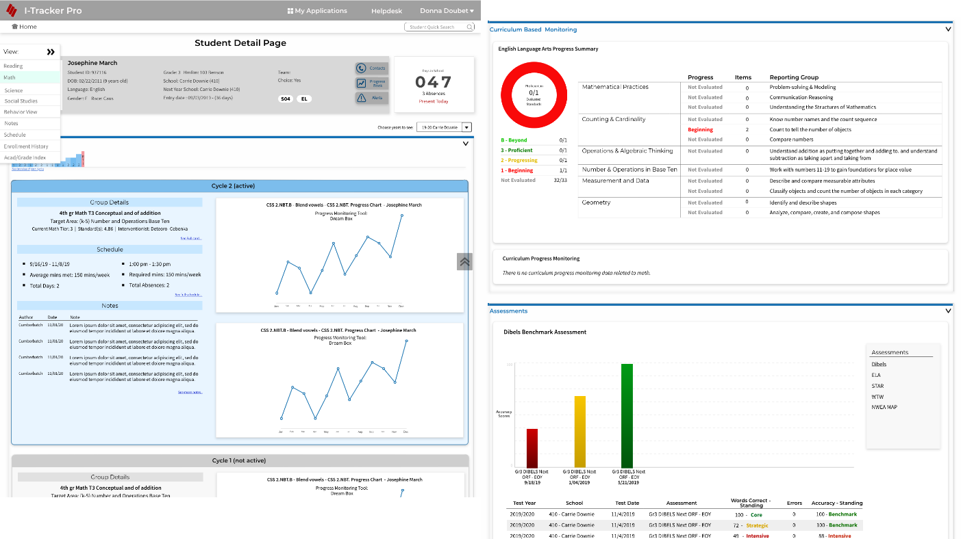
I sectioned the data into “views” based on the most common goals our users were responsible for. I also prioritized the data on each view based on the way I observed the users answering their own questions; Does this student have intervention already? How are they doing right now in school? Where did they struggle in assessments? Have they always struggled with assessments?
Usability Testing & Changes
Change #1:
Even with all the data broken into “views” and sections, it was taking the user too long to find the data in tasks, I decided to expand the views panel to a full fly-out with subsections for quick navigation.
Change #2:
The user cared more about the order in which assessments were given across the brands, than having them sectioned by brand. To allow the user to see all the assessment data in one place I added quick year selectors to the top of this section.
Change #3:
Secondary schools expressed that their interventions became more targeted than elementary schools because they were focusing on getting students “ready to graduate”/”ready for a career”. I knew adding a “Graduation view” would help them.
A/B Testing:

Version A: Interventions by Cycle
I found that users could not pick up on the color scheme change between the years in this version. While the history of cycles mattered to the user, it was important for them to quickly understand what was happening each year.

Version B: Interventions by Year
I found that the user could quickly understand the data when the color scheme contained only two colors. The users also preferred to consume the data by cycles within a year in the tooltip.
Final Design
- To bring important details not associated with any view or crucial to decision making to the top of the page so the users did not have to search for the information they might need at any point.
- To start the views with ELA and Math views first since they are held as the highest priority due to the fact that the state used these as indicators for a school's success rate.
- To add a detailed intervention timeline so the user could quickly see the student’s journey with intervention without searching year and by and storing data outside of the system.
- To add graphs that better fit our users need to easily consume the data, see trends and progress, and know which component the interventionist was measuring.
- To add section links to the flyout menu so that a user could quickly access a part of the page.
Dashboard final decisions:
- To start the users at the classroom level so that the system mimicked their natural process. Previously a user only could access the student detail page by digging into the advanced search or clicking into their groups from the main menu of no less than 30 links. I designed a friendly dashboard that welcomed the user to easily investigate students.
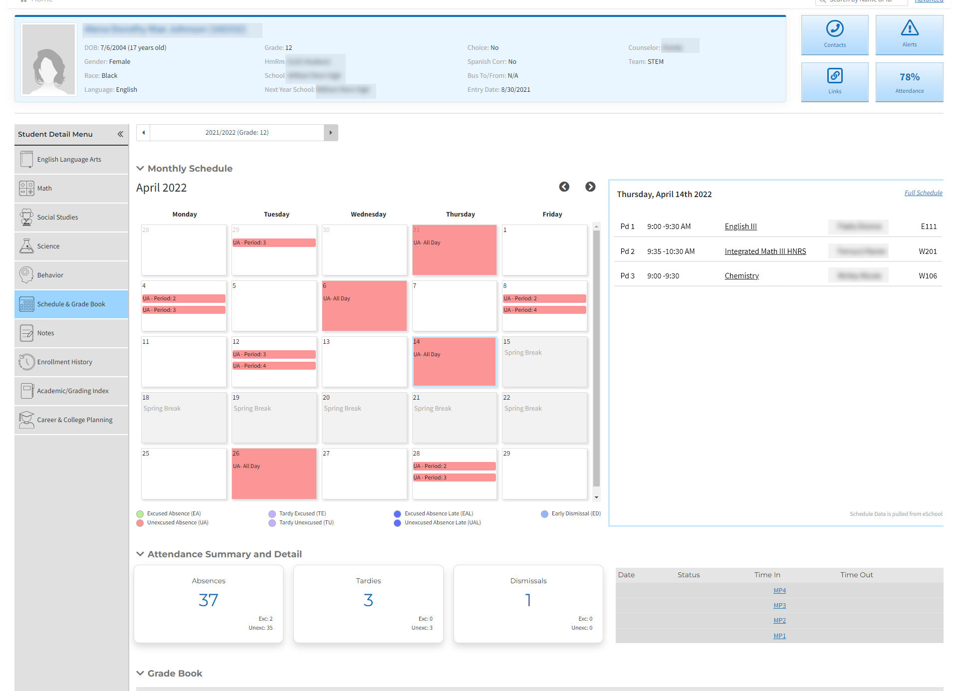
I designed a behavior, schedule, and graduation view for students. This was the first time we incorporated this information into the system.
Behavior view final decisions:
- To incorporate disciplinary actions and referral summaries from other applications so that a user didn't have to have multiple tabs of our application up.
- To bring all notes tagged with a behavior subject to the view so a user didn't have to sift through a long list of irrelevant notes.
Schedule/Attendance view final decisions:
- To add the summary details of attendance and add a calendar so users could visualize patterns that were emerging.
- To add the day's corresponding schedule to the right of the calendar so users would have the next step of finding out who to contact right in front of them.
Graduation view final decisions:
- To create this view with helpful infographics so the user could quickly assess if an immediate intervention was necessary.
BIG WIN #1: We cut a user’s time down to get to the information they needed by an average of 60% (obtained with User testing).
BIG WIN #2: We have increased our yearly users by 15% and bounce back rate by 10% (obtained from google analytics).
BIG WIN #3: The Director is confident the state will continue with I-tracker as the official Intervention tracking system for all Delaware schools.
Next steps: The next step for the student detail page is to take the idea of students' notes to the next level. Through careful tracking and creation of note tags, we are hoping to create reports giving leaders more insight into what is happening with a student.
