Choice Application
Choice is an application that handles the process of a student trying to attend a school outside of their attendance school zone (based on their address). The application helps choice administrators manage applications, run a fair lottery, and generate official letters for the parents.
The goal was to find ways to make the application easier to use, tackle common problems the helpdesk received calls for, and create strategies to avoid applications getting “lost through the cracks”.
My role
Sole UX/UI Designer on the project in charge of the full design process.
The team
Myself, a project manager, a helpdesk employee, and one developer.
Tools
Interviews, Adobe XD, Illustrator, Figma.
User research
Key Finding #1:
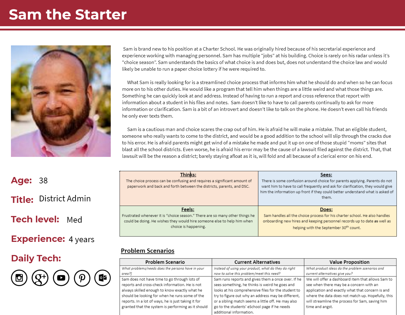
In interviews a common feeling among users was anxiety. The choice process was intimidating and the users were “afraid to make mistakes”.
Takeaway: I knew I would have to establish a sense of confidence in our users. I wanted to target the pre-lottery part of the process since it was causing the most amount of anxiety for our users.
Key Finding #2:
While interviewing our experienced users I asked them to find the answer to a few questions with reports in the system. Of the 5 tasks most of the users could only complete 2 of them, they often responded that they had no idea there was a report in the system that could help them with that.
Takeaway: I knew we had to utilize our reports in a way that reached out to the user instead of waiting for the user to find it. I also saw opportunities to add helpful text to prompt users to explore the system more.
Key Finding #3:
I found that many of our users were responsible for an entire district's choice applications, sometimes leaving a user 3 months to manage over 2000 applications. It was important for the users to have the applications processed before the lottery, but often they were finding applications that they overlooked up until the day of the lottery.
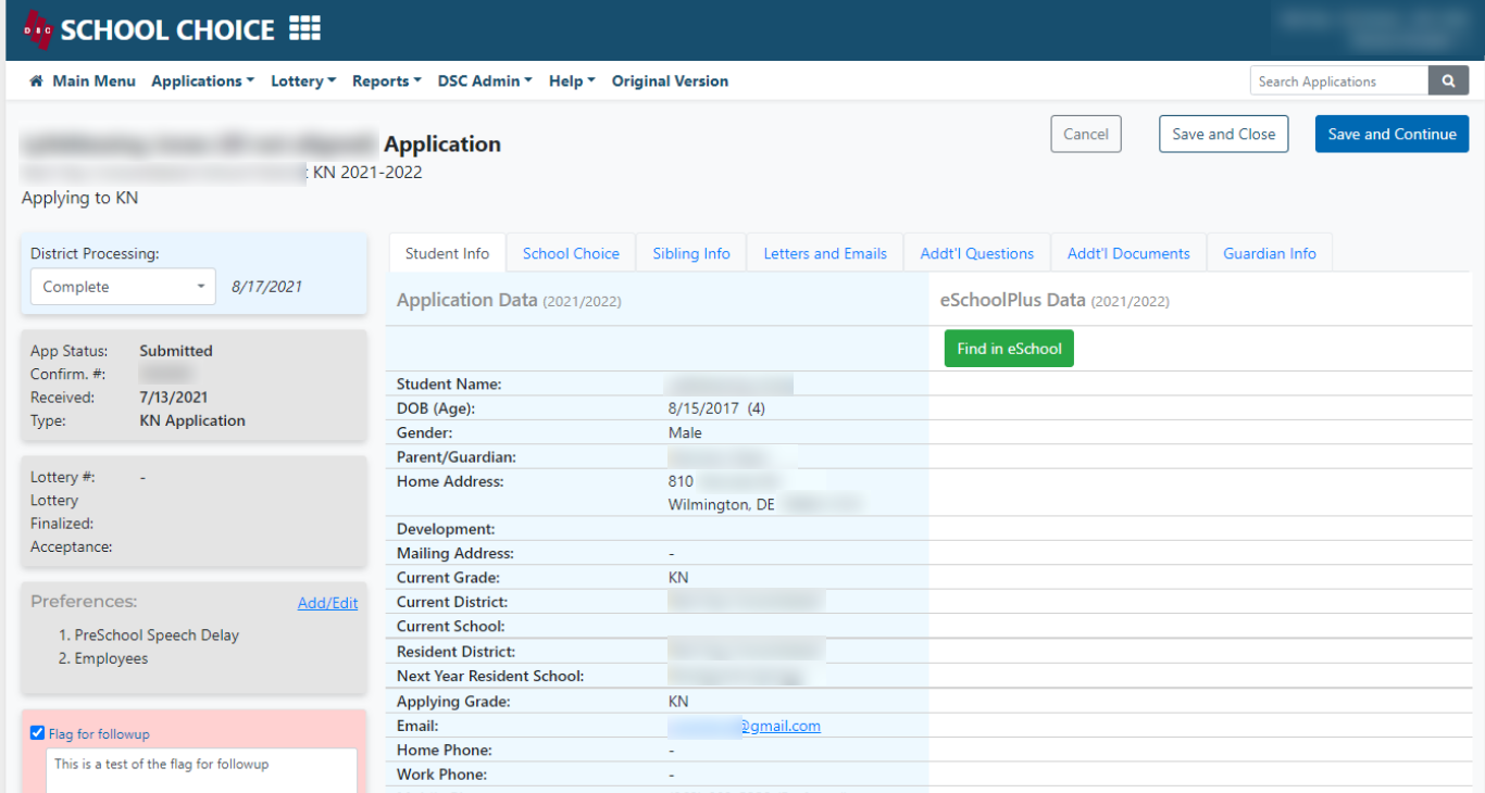
Takeaway: I wanted to add a function for users to be able to “flag” an application. Then they could have a step in between an untouched application and a completed one. This would help them not lose the applications that were in limbo (i.e. waiting for the parent to finish uploading documents).
Key Finding #4:
Many users expressed their frustration around the school capacities, not only was it time-consuming but they were required to use the numbers provided by their districts which led to more work for them after the lottery was run.
Takeaway: It would be my goal to save the user time, allow them to manipulate the numbers to better reflect the number of students they could actually take in, and provide them with trends to make informed decisions.
Design process
Low-fidelity Mockups
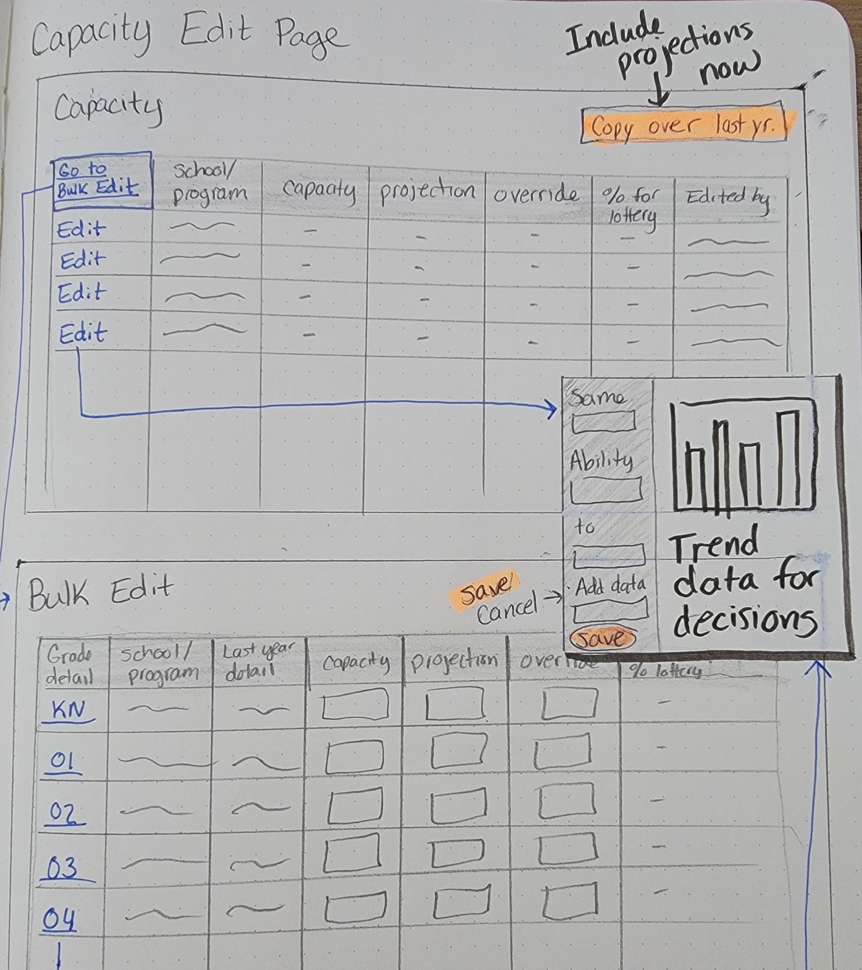
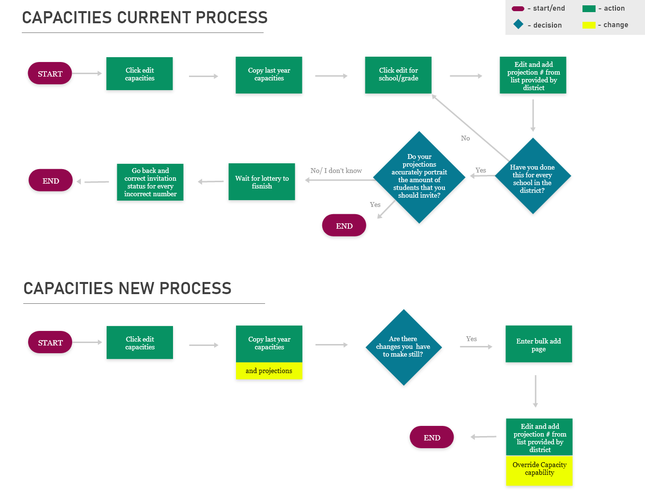
Capacities: I wanted to add the ability for a user to override the capacity. By allowing both capacities into the lottery they would be able to have an intake of students that truly reflected their school size. Bulk adds and calculations based on previous years would also help them save time.
Manage application page: I decided to make a distinction between the application (what the parent submitted) and what a user was responsible for (processing the application, taking notes, marking preferences). I also wanted to bring the most important things out of the application so the users could see them at all times.
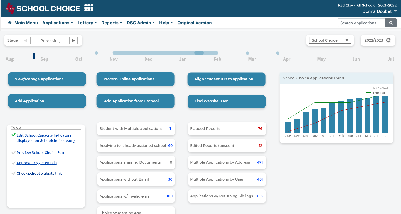
Dashboard: I wanted to give the users a dashboard that would help draw out relevant information compared to their current main menu of 30-50 links. I had the idea to break the dashboard up into 3 stages I observed take place; Pre-lottery, Lottery, and Post Lottery.
Usability Testing & Changes
Capacities Change:
While observing the users I found many of them were calculating specific numbers to make their capacity projected 85%, upon further questions I found that this was known to be accepted by the state as close enough to capacity that they would not have to open up for a lottery.
Dashboard Change:
I got feedback from our users about the stages, including that they actually consider the lottery result links as part of the second stage. They also commented that it would be great to have all of their responsibilities on the to-do list so they knew what they should be doing.
Application Page Change:
Originally I only put the pre-lottery things on the sidebar, users expressed that they also come back into the application shortly after the lottery and they would benefit from seeing that information as well. I decided to add one more widget with this information, causing a design change to keep everything above the fold.
Final Design
Capacities final decisions:
- To create three layers for a user when it comes to adding their capacities; simple to confirm details, bulk adds for mass edits and heavy detail for maximum investigation. This was done to accommodate the three user journeys that existed when editing capacities. The first layer was the same as the one they had now and I kept it simple for users who were not making any changes from the year before, I also added a copy over from last year's function. The next layer was a bulk add page where the user had last year’s data and the ability to override their capacities to help with their real situations. The last layer was the one for intense investigation. I allowed the user to access this layer from both pages and included the 4-year trend data and the capability to override the capacity.
- To allow a user to override a capacity so that their lottery reflected the reality of the school and would ultimately save the user from unnecessary work after the lottery.
- To add quick calculations for the % capacity when adding an override number since I observed the users often making these calculations outside the system.
Dashboard final decisions:
- To split the dashboard into 3 sections; Processing stage, Lottery Stage, and Invitation/Decision stage because users agreed that the three stages, while unspoken, existed.
- To include a timeline of the Choice process to help keep users on track and confirm some of their assumptions.
- To create report widgets to better inform users what was happening without them digging for the information. By utilizing this design I could also mute information that was irreverent, summarize what was happening in each category and draw attention to reports that were pointing out problems.
- To, for the first time, including a to-do list to help inform a user of their responsibilities so we did not have to rely on the user to remember what they were told to do at the annual training meeting.
Application page final decisions:
- To make a sidebar of widgets that provided the users with information that they often needed to save them time when managing applications. Having the widgets editable by pop up saved valuable real estate and narrowed a user's attention to only the important information.
