504 Application
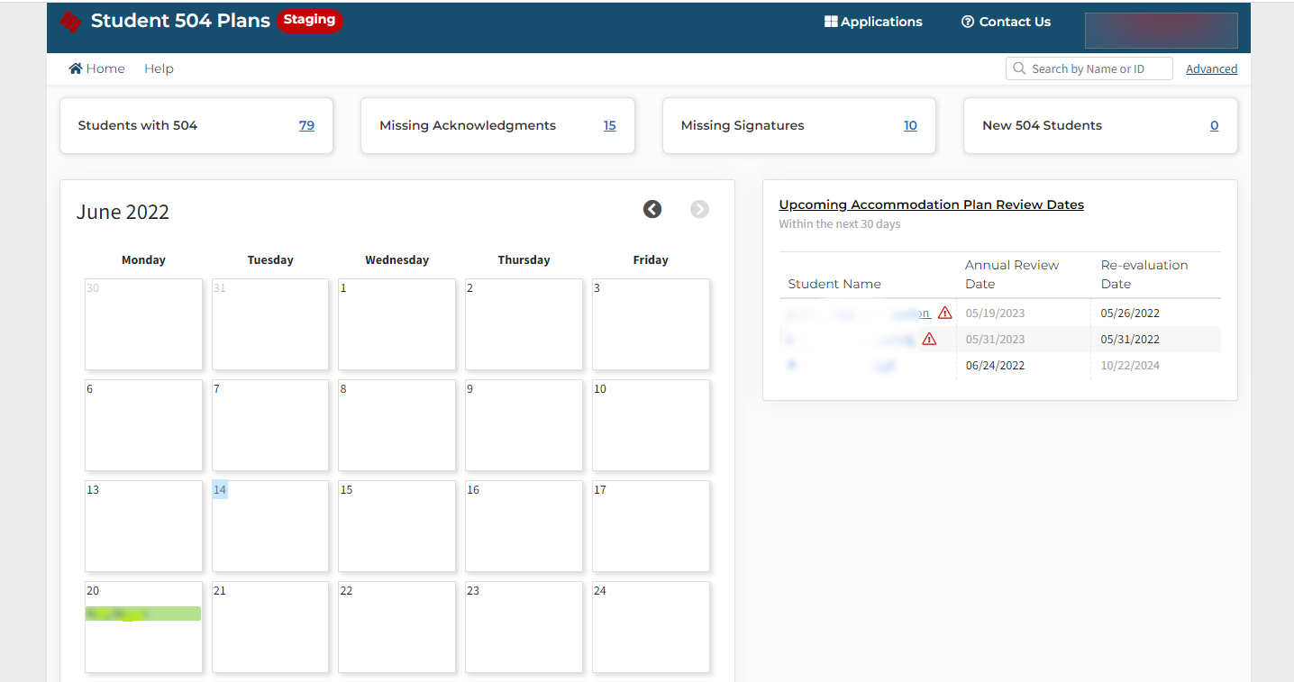
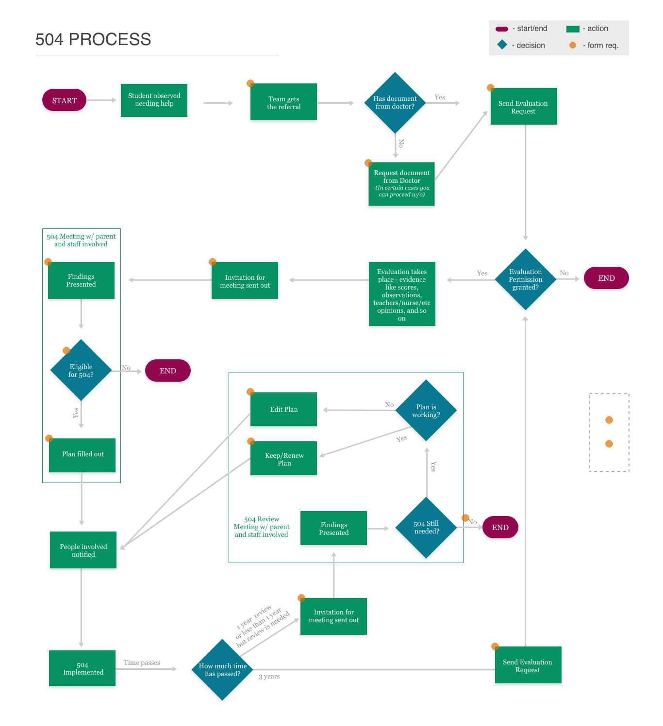
504 Plans is an application for school counselors that supports students with 504 Accommodation plans and protects the districts from legal troubles. Schools are required to offer 504 Accommodation plans for any student in need. Prior to our development, the lack of process and accountability in schools led to many districts facing litigation.
I was tasked with creating an application that would allow a user to prepare the correct documents for a student, track the 504 journey for a student, and hold all parties accountable.
My role
Sole UX/UI Designer on the project in charge of the full design process
The team
Myself, a project manager, two developers
Tools
Surveys, interviews, focus groups, Adobe XD, Illustrator, and Figma
Competitor research
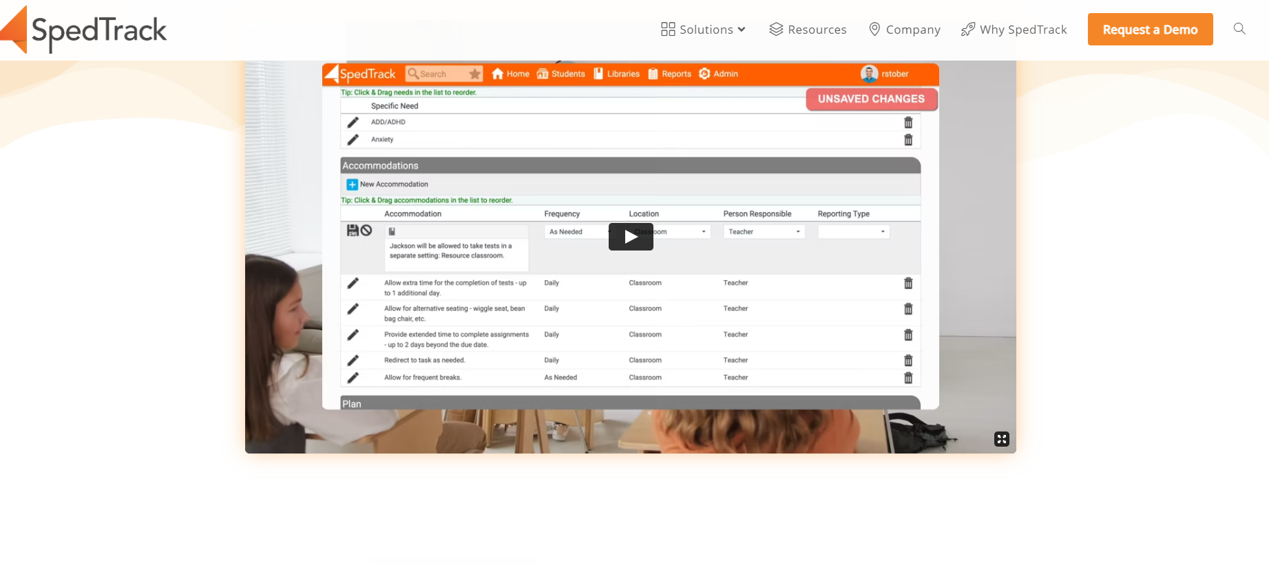
Key Finding #1:
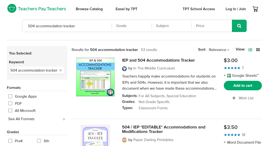
There were many online resources, but these lacked the professionalism a legally binding document required. Users had to fill out the documents by hand/copy them if they wanted to share them with parents. This method still puts the responsibility of keeping the physical papers neat and organized on the user.
Takeaway: I would need to find the perfect balance between allowing our system to have the look/feel and usability of an application worthy of holding legal documents while making it approachable for our users not familiar with our applications.
Key Finding #2:
Some schools used Google Docs for its flexibility when organizing their papers. However, forms were inconsistent even within their own school since users could edit them without anyone knowing.
Takeaway: I understood that users enjoyed the flexibility they felt this program had however they still grouped all of the documents around the creation of the 504 Accommodation Plan. I knew it would be important to make this app flexible but impossible for the user to manipulate documents.
Key Finding #3:
There were a few web-based applications to help track 504 programs, but most of their forms lacked the specific questions the state required. Most set up a framework to track a student’s 504 journey but did not have anything in their system to hold the people involved accountable.
Takeaway: Takeaway: I decided to add a teacher side to this application would be its main selling point. Adding this side would allow teachers to have more accountability and would relieve counselors of a lot of work and stress.
User research
Key Finding #1:
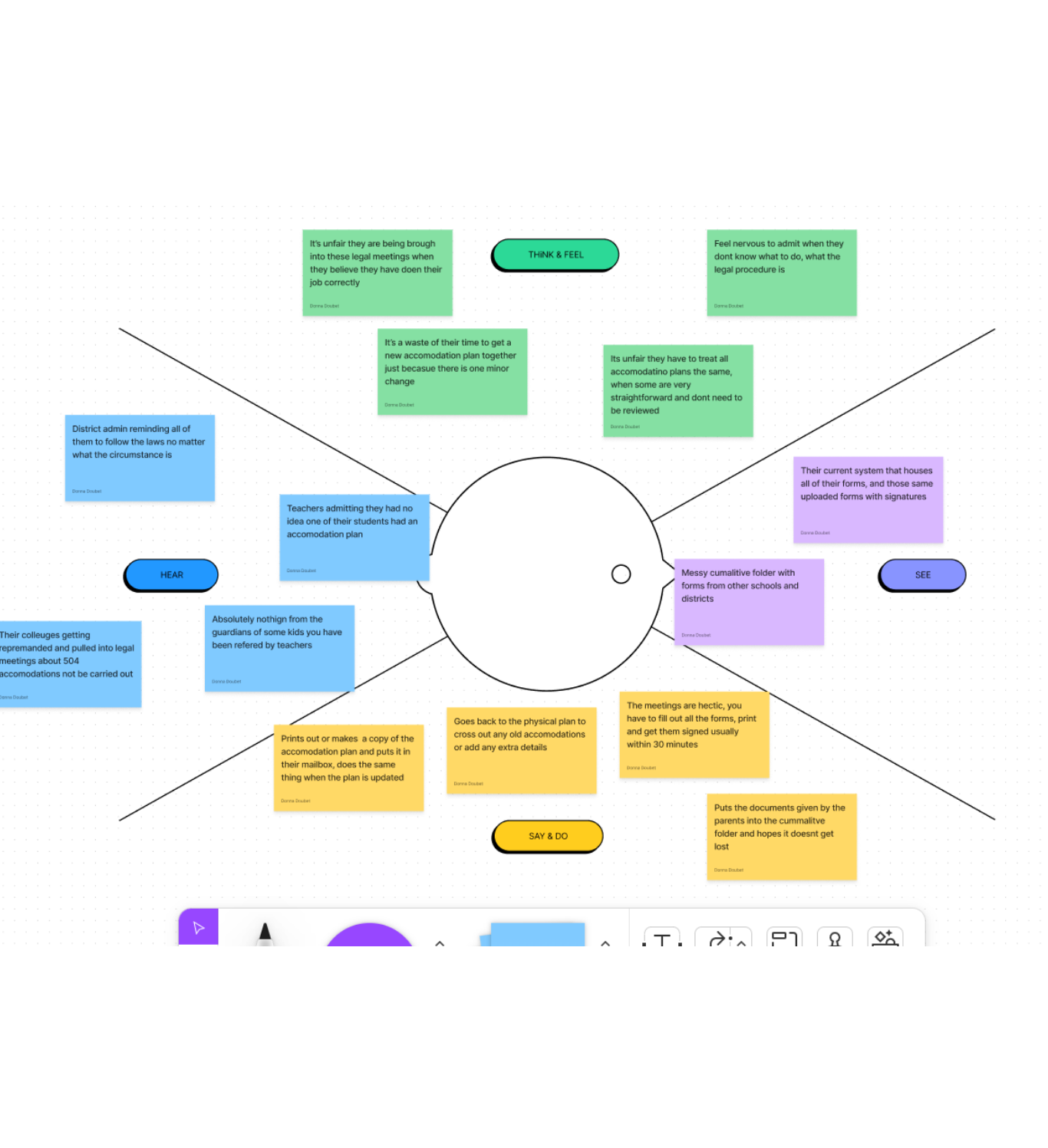
While shadowing users I was able to observe their entire process of getting a 504 Accommodation Plan for a student. It was apparent there were a lot of similarities across the districts but their forms were different.
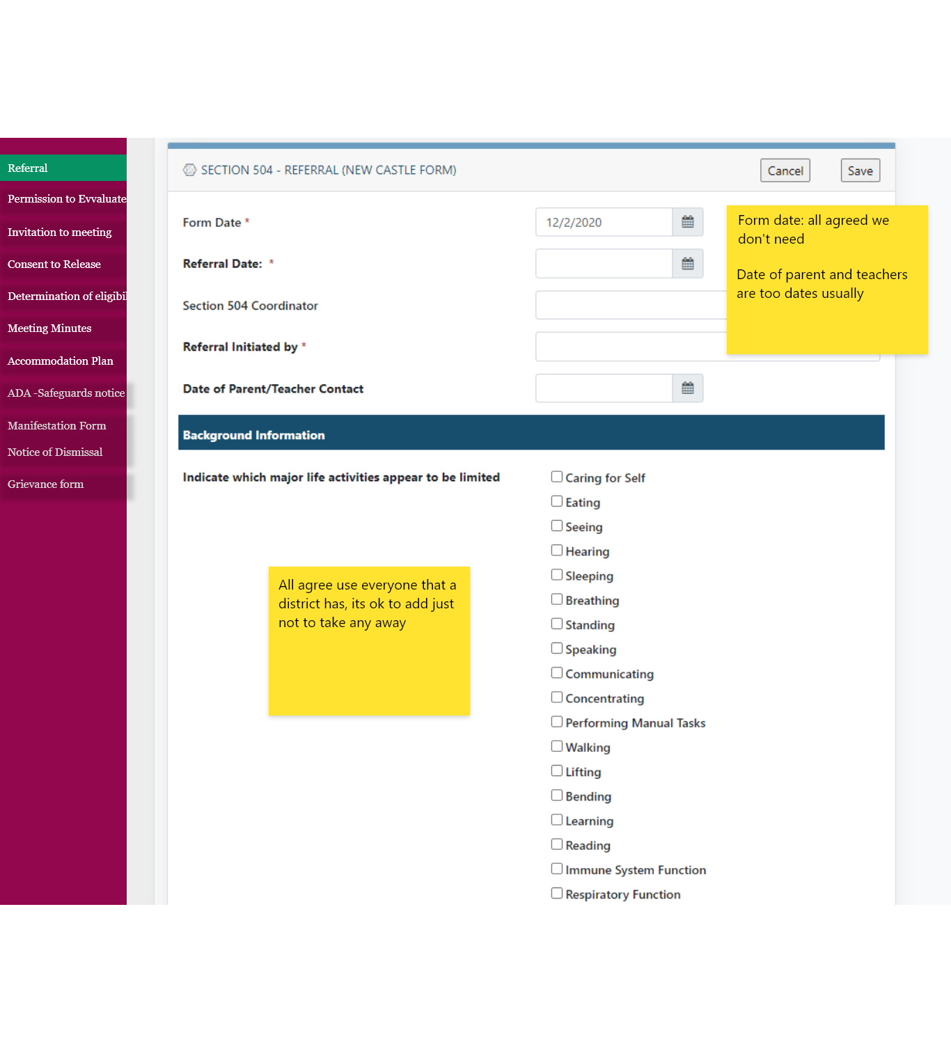
Takeaway: I knew I would have to hold a focus group with the heads of each district to get the official forms that could work for everyone in the state. This was accomplished with the 6 biggest districts in the state.
Key Finding #2:
I learned that after a 504 Accommodation Plan was signed by the legal guardian, they would print out the plan and put it in the mailbox of every teacher that was responsible to carry out the accommodations. Once that was done the counselors assumed their job was done, however many were finding themselves in trouble for not making sure the teachers were aware of the plan.
Takeaway: I once again saw an opportunity by having a teacher side of the system. By tracking a teacher's acknowledgment of the plan, we could inform the counselors and solve their problem of communication.
Key Finding #3:
After interviewing the Department of Education I learned in the State of Delaware a cumulative folder follows the students to their schools and obtains all the paperwork associated with them, including their 504 information. This filing system often left the users with an unorganized folder and missing/outdated important documents.
Takeaway: I wanted to take the idea of this cumulative folder and the stacks of 504 documentation inside them and apply it to the application, knowing it was something every user was familiar with.
Key Finding #4:
Some documents weren’t considered complete until signed by the legal guardian. When a minor change occurred the user often made that correction on the already finalized document (often with the parent’s permission) due to the fact that recreating the document took a lot of time.
Takeaway: I knew I had to establish states of a form when they could be edited vs when it was official and a user should create a new one to change it. I was also aware that users would not be happy with this change, so I would have to find a way to offset the update.
Design process
Low-fidelity Mockups
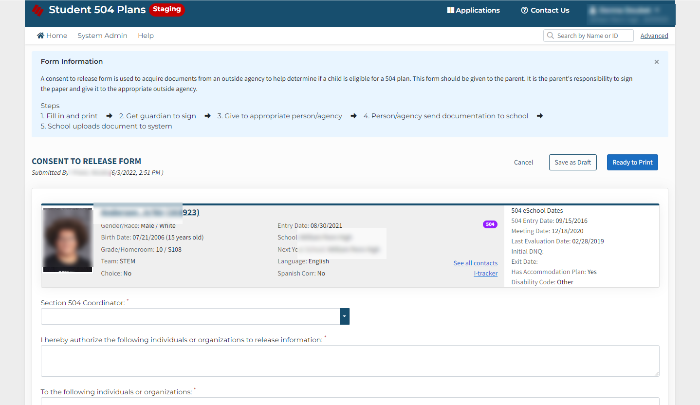
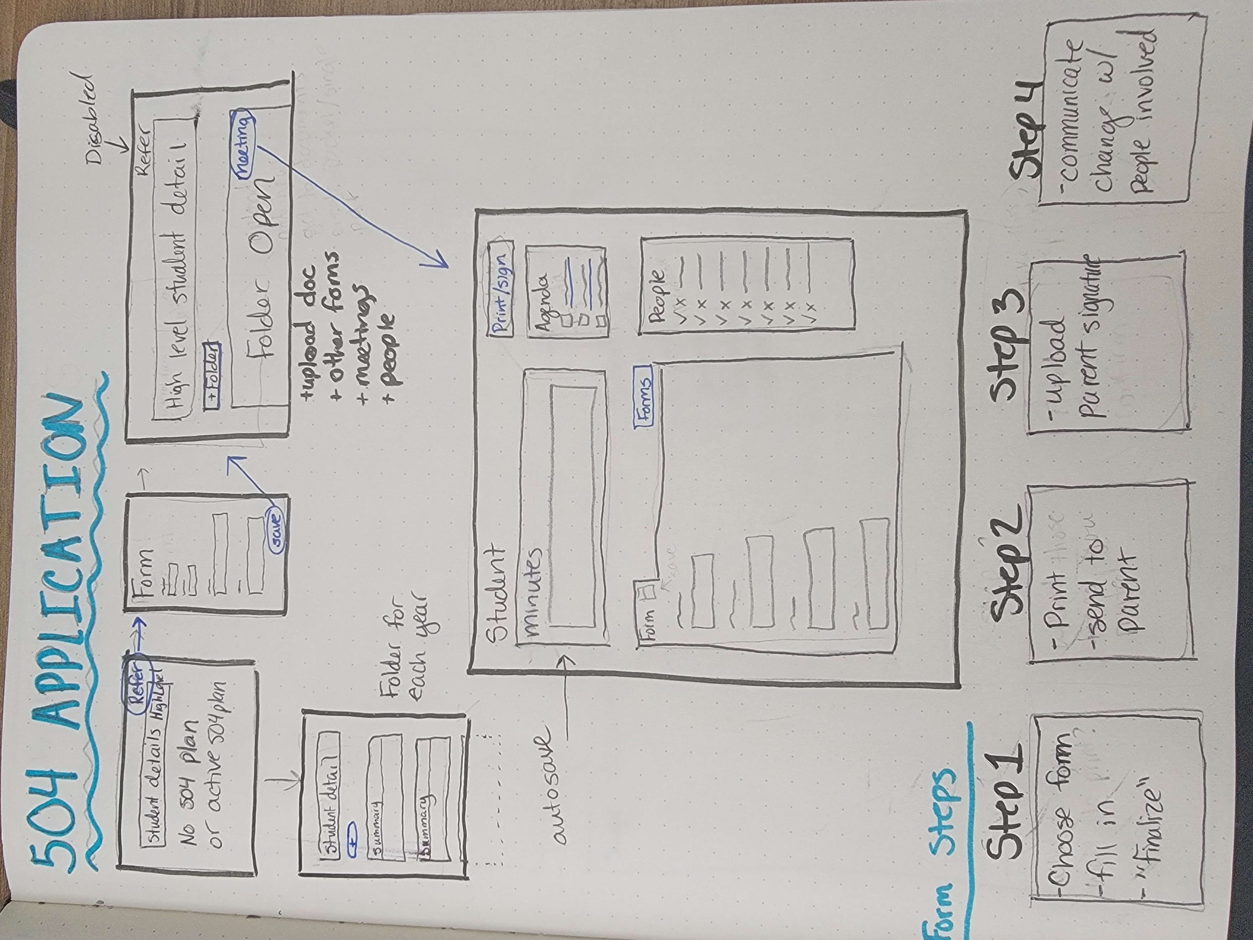
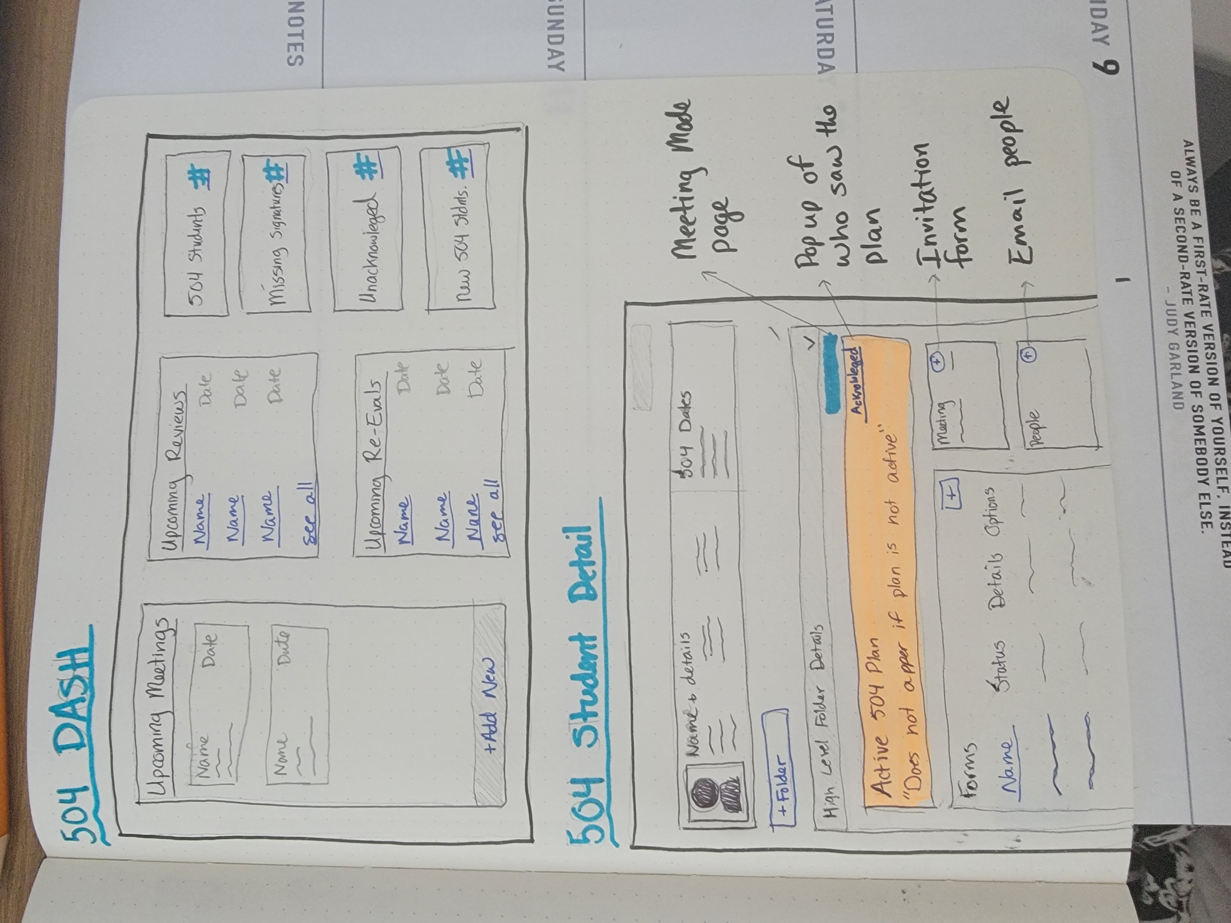
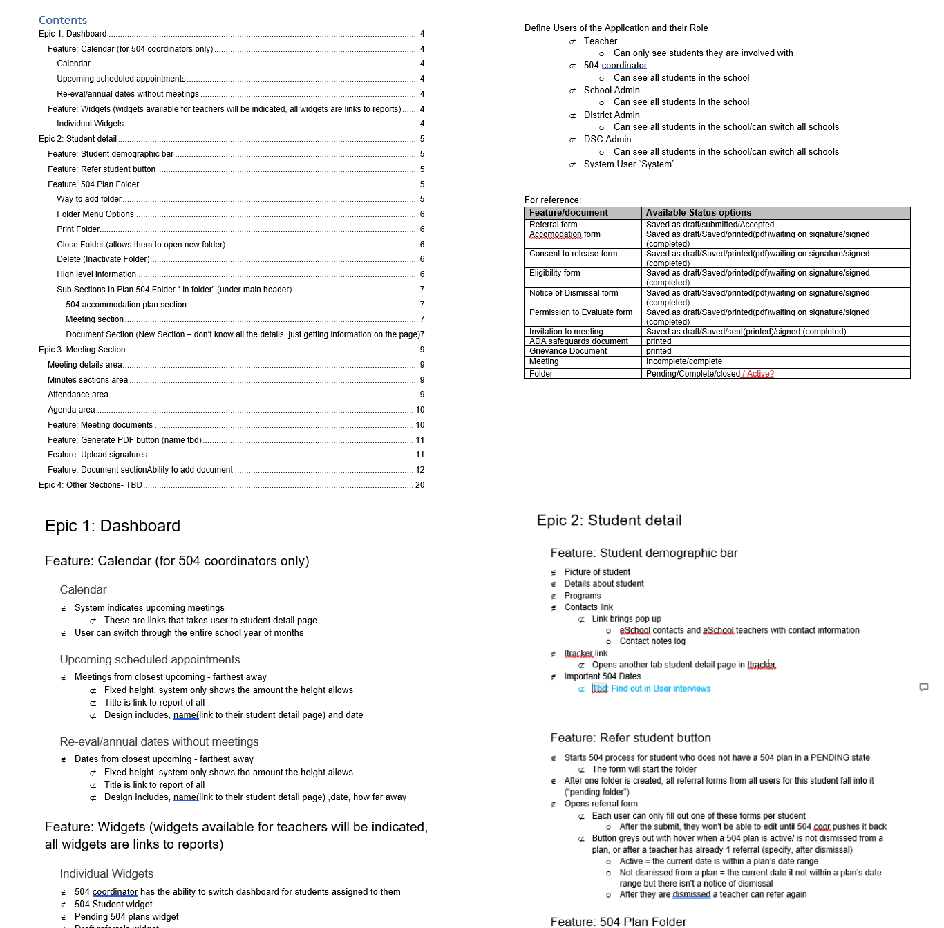
Using the information I obtained in my user research I created sketches and a requirements document to help demonstrate the direction of the application to the District Leads. After that I created a low-fidelity prototype for 3 common user flows, creating a form, uploading a signature, and checking who has acknowledged a plan.
Usability Testing & Changes
Change #1:
Forms: I initially designed the actions for a form in the same row as the form. The muscle memory of users took them to the form too often, instead of the actions though. This prompted me to change the CTA buttons on the form depending on their state, so the user could still complete their action.
Change #2:
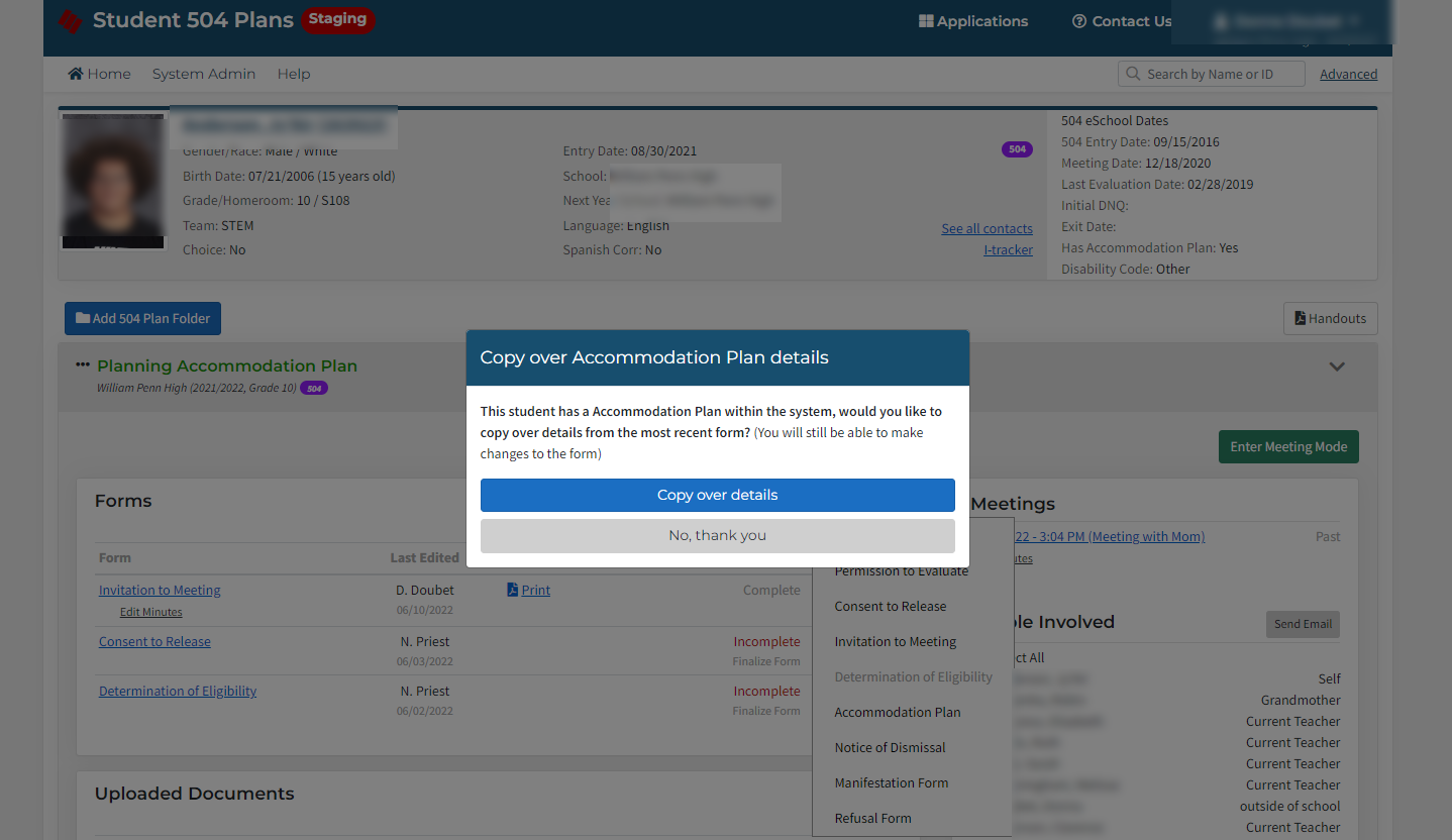
Folders: Users had a hard time understanding when to create a new folder. I decided the best way to establish this new process was to only allow one plan in each folder. I had the accommodation form disabled once one was created with a tooltip.
Change #3:
Reinforcing Distinct Process: The district leads wanted everyone to use the invitation to meeting form to document what has happened, but users (even when trained) kept skipping this part of the process since they saw no value in it. Users did use the meeting minutes form, so I combined the two to help reinforce this process.
Final Design
Folder final design decisions:
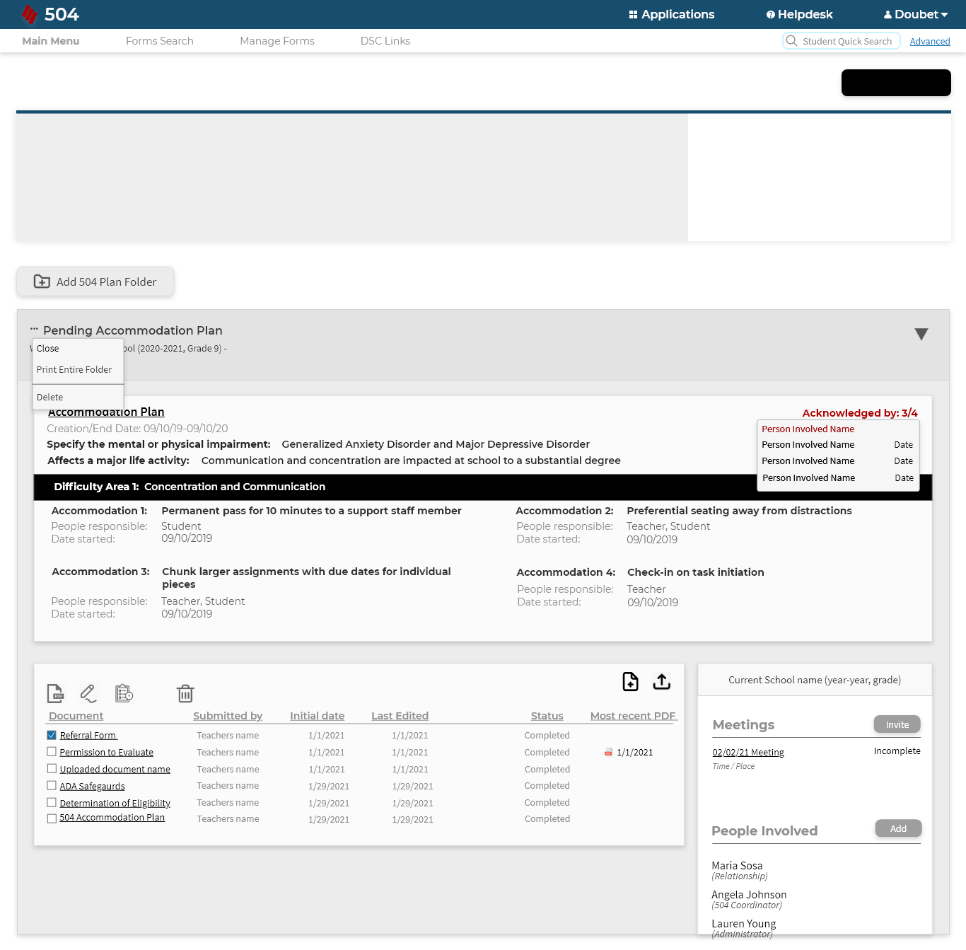
- To make a folder structure to mimic the “stack of papers” in each student’s cumulative packet, so that there was a familiarity with our product.
- To make the folders collapsible with an informational header, so that the users could have a quick snapshot of information and not be overwhelmed by all of the forms that would accumulate.
- To make folder states active and not active (blue and gray), to help a user better understand which accommodation plan is recognized as the current accommodation plan.
Accountability final decisions:
- To create a teacher side to the application so the teachers (most often the people in charge of carrying out the accommodation) had a place to always check on the students they are responsible for.
- To add an acknowledged button so that the teachers could prove they have seen the plan and the counselors could keep track of who was aware of these plans. Once active the plan was displayed at the top of the folder and an email was sent to every teacher on the student’s schedule.
Form final design decisions:
- To only allow one accommodation plan per folder so that the user could not edit the old plan/get confused about which plan was correct and to reinforce the state’s request to “prove your work”.
- To create a copy over previous plans details button to help save the users time when amending/renewing 504 accommodation plans.
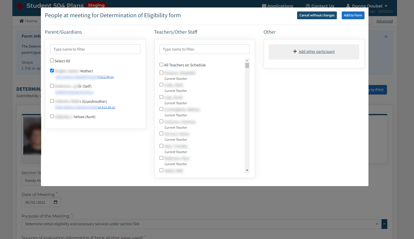
- To redesign the forms for better readability and include a smart “people involved” section to help make the process easier for the user. Previously they would have to type each person and their relationship, while now we had a selection of everyone who might be involved with the most obvious ones pulled to the top.
BIG WIN #1: Purchased by 5 districts (including the 2 biggest in the state) after staging demonstrations.
BIG WIN #2: Through surveys, we found the likelihood of a user now following the district process (documenting a meeting, creating a new 504 plan with every change) was at 95%.
Next steps: The next step is to perfect the idea of meeting mode. This is a page the user can enter through a folder that allows them to open multiple documents at the same time. On this page, the documents autosave every minute to make sure the user does not lose work. It also has a section for meeting minutes, so they can take notes in real-time. I'm hoping to incorporate some of the actions that naturally take place in meetings, like the live signing of documents and attendance taking.
